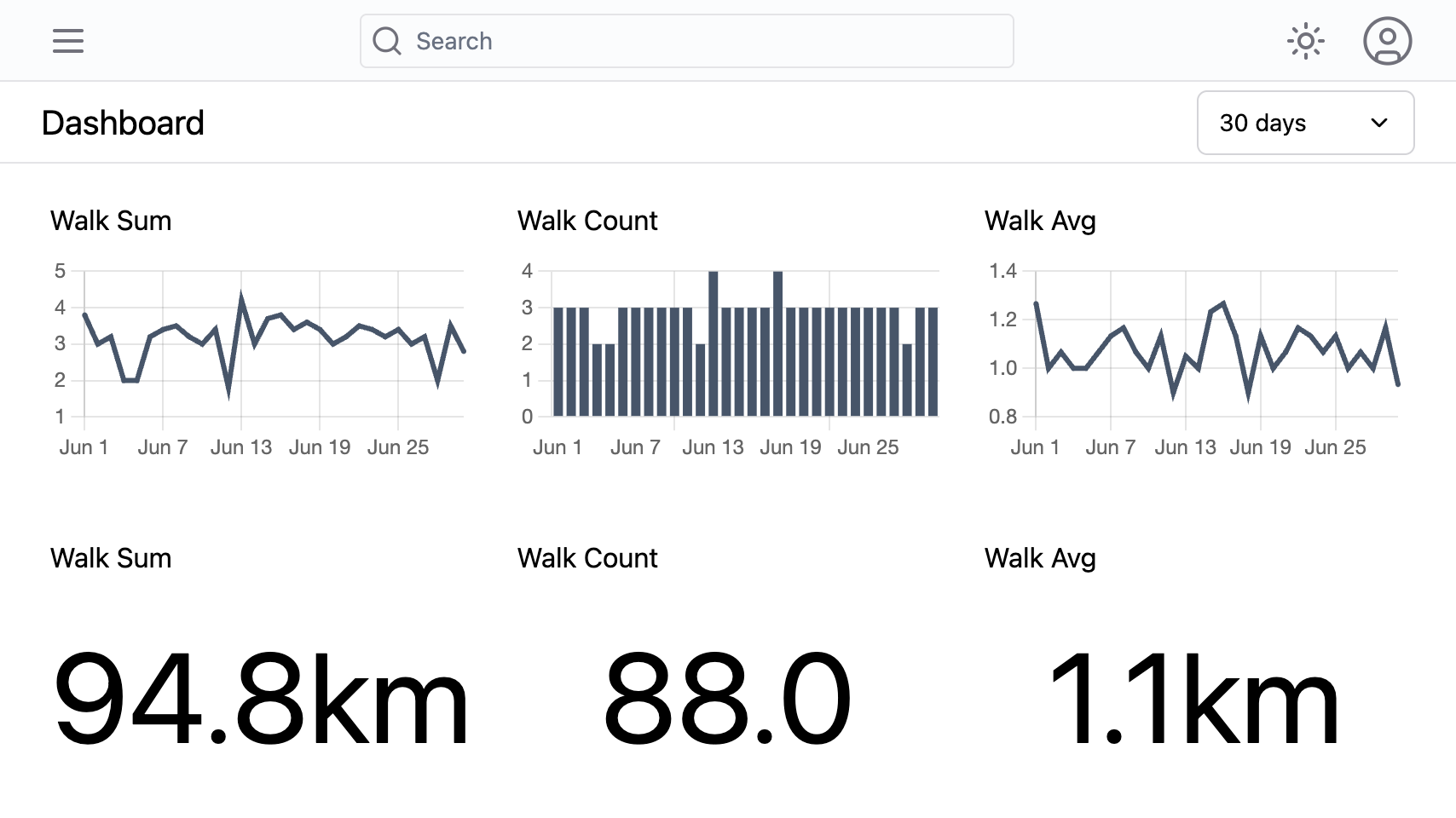
The dashboard page lets you create charts to display analyses of your journal entries. This is useful for graphing trends over time or displaying grand totals, for example.
Each chart has the following options:
- series (optional): The series to restrict the analyses to
- aggregate: How to combine the entry values:
count,sum,avg,min, ormax - presentation: Choose to present the data as a
timeseriesgraph or assummarytext - measurement: The type of data being measured:
discrete(for counts, categories) orcontinuous(for measurements, amounts)
The measurement type affects how timeseries charts are displayed: discrete data is shown as bar charts, while continuous data is shown as line charts.

To modified or delete a chart, open the chart menu using the menu icon to the top right of each chart.
The order of the charts can be changed by dragging and dropping the charts into place.
Use the input at the top right of the page to modify the time range displayed by the charts. The time range can be set to the past 7 days, 30 days, or 90 days.